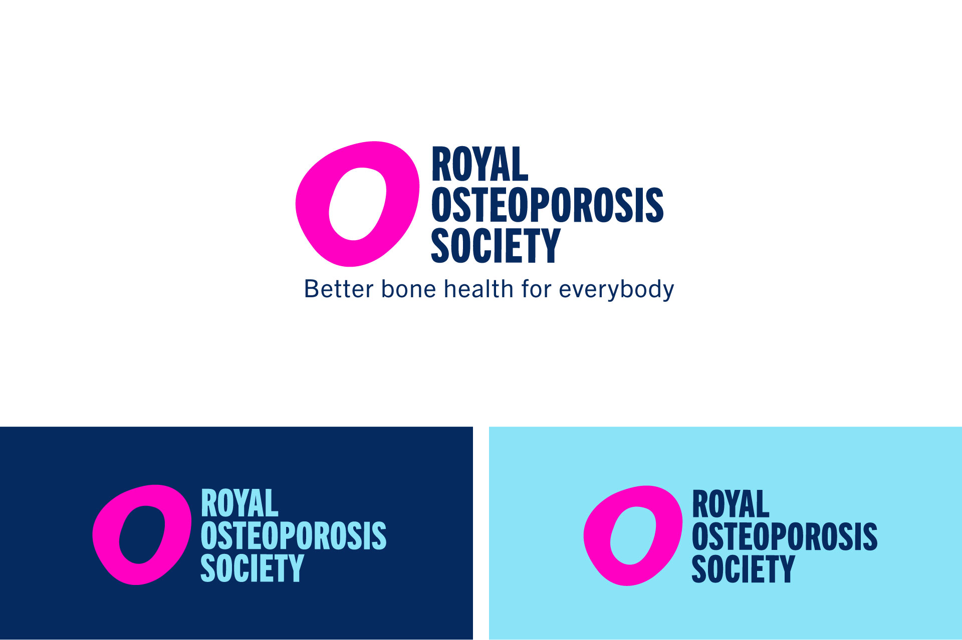
Royal Osteoporosis Society Rebranding
Role: Lead brand designer
Client: Royal Osteoporosis Society
Agency: Mere Mortals
Creative Director: Robbie Greatrex
Strategy: Amie Brown
Royal Osteoporosis Society is the UK's largest national charity dedicated to improving bone health and beating osteoporosis.
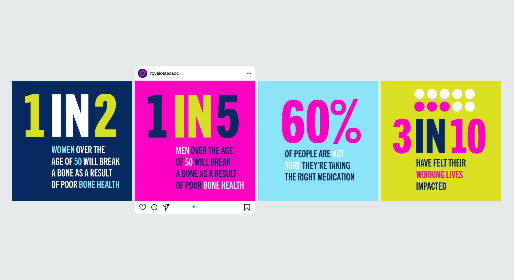
Osteoporosis causes bones to lose strength and break more easily. Half of women and one in five men over the age of 50 will break a bone as a result. In the UK, a bone is broken every minute because of osteoporosis, causing pain, fear and isolation. Yet osteoporosis is often described as the 'silent condition' because it is under-diagnosed, under-treated and poorly understood. The Royal Osteoporosis Society is breaking this silence.
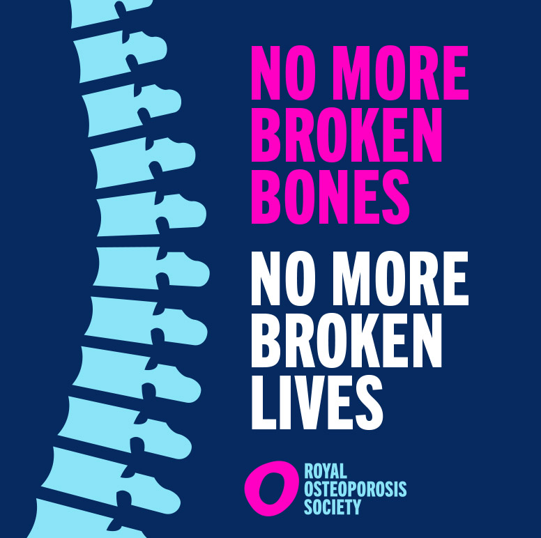
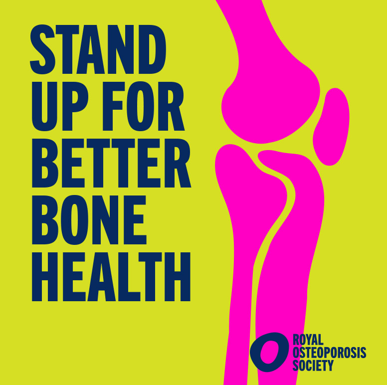
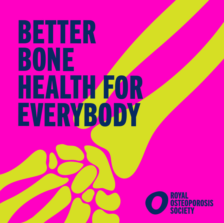
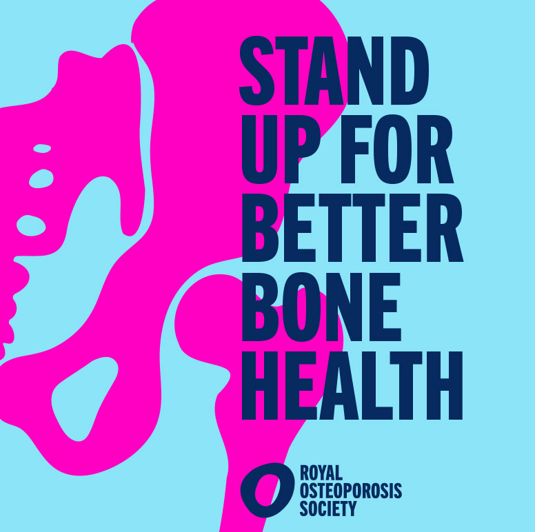
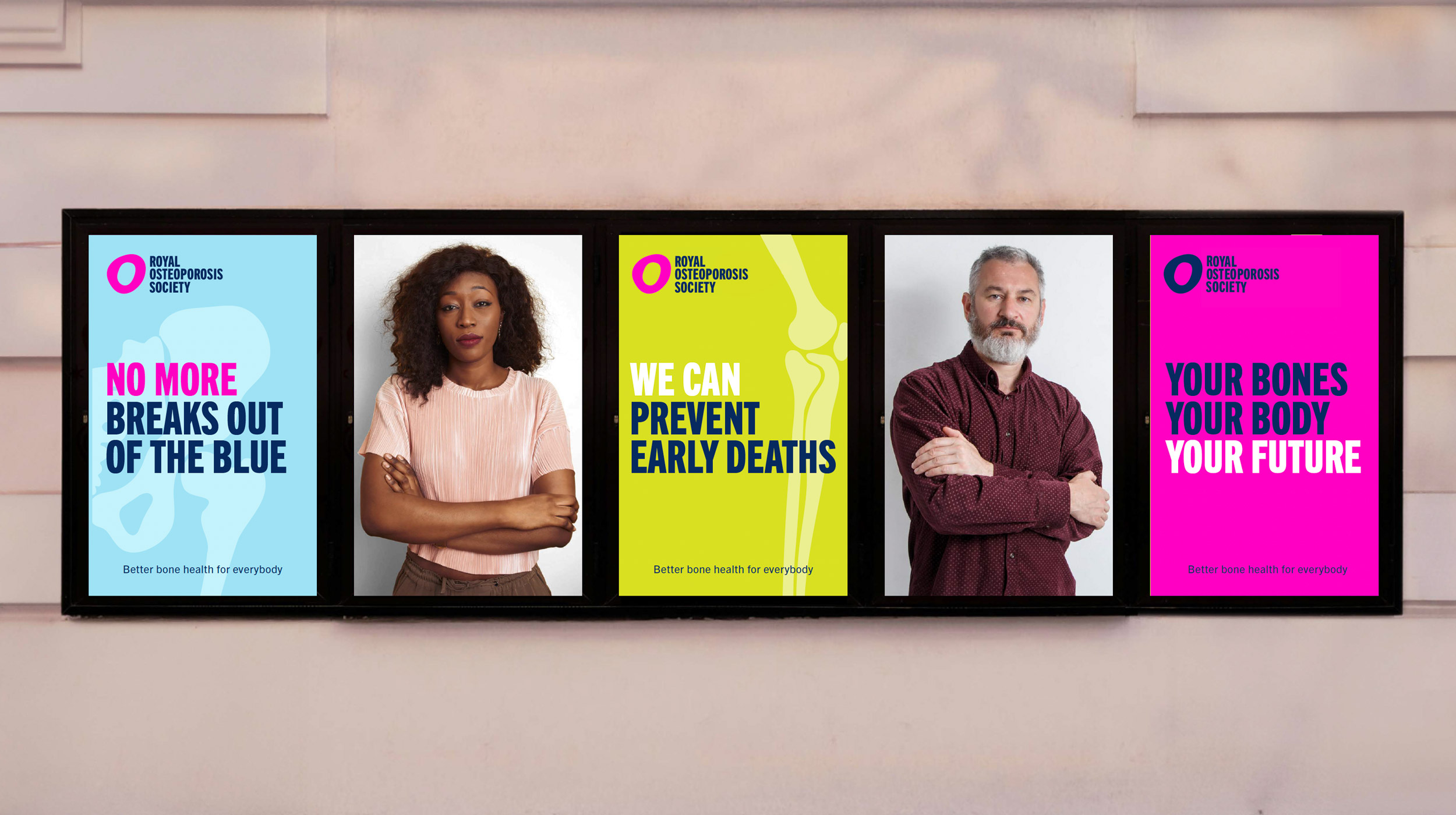
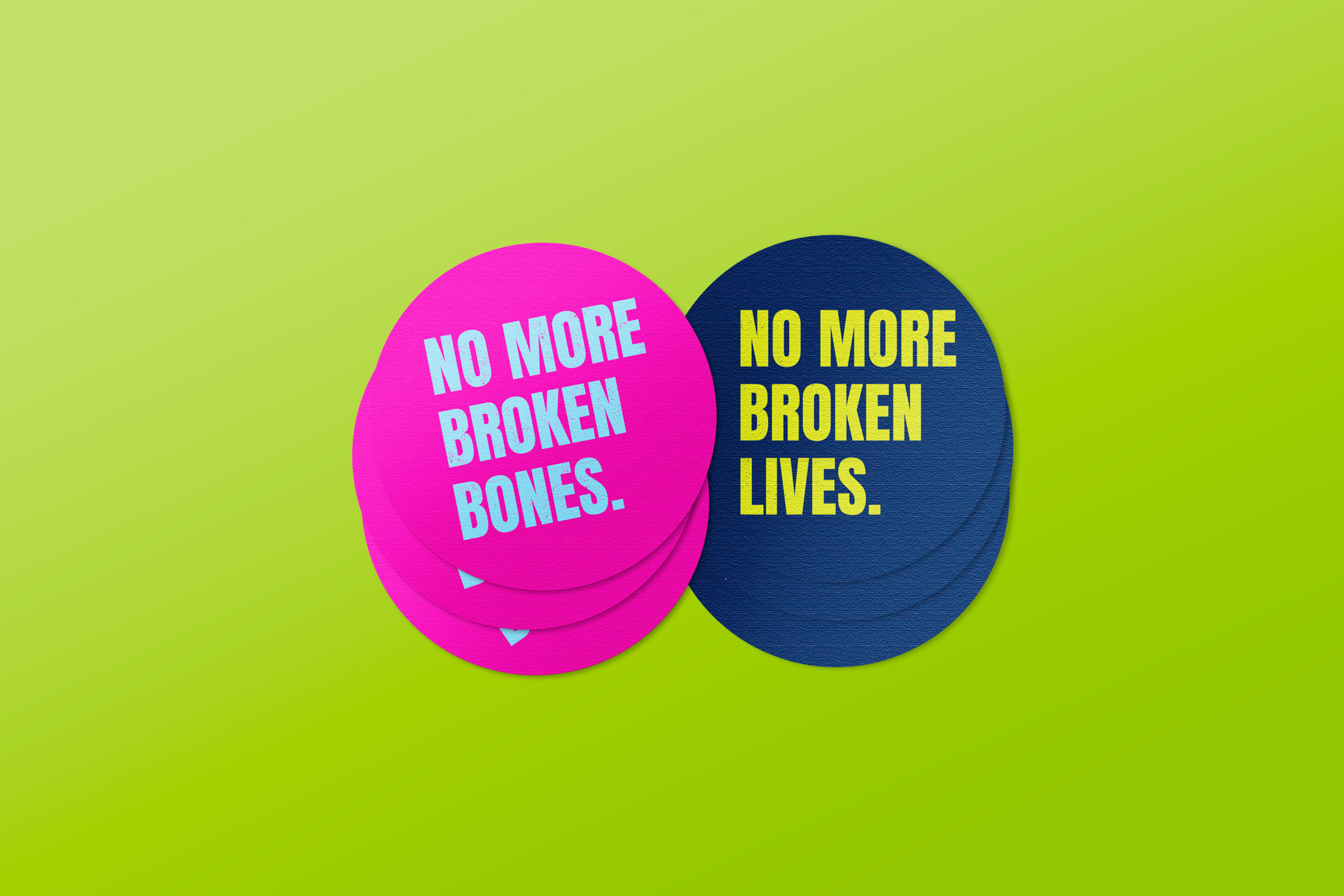
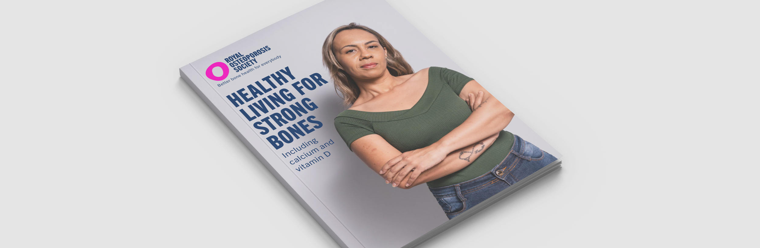
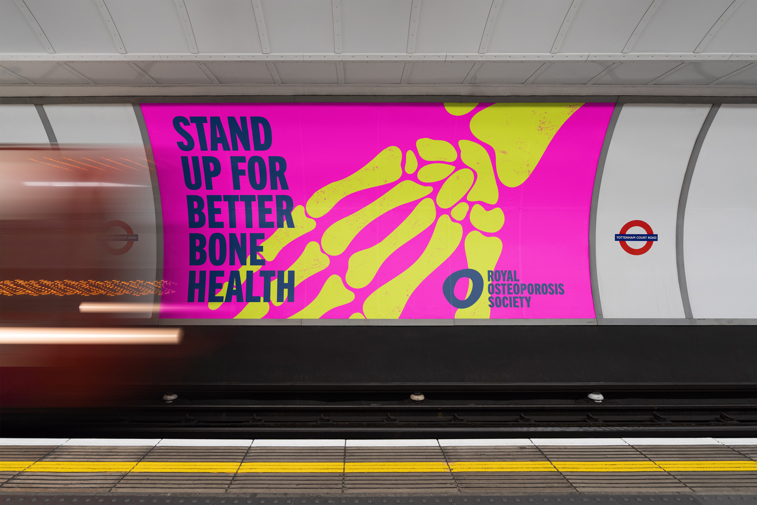
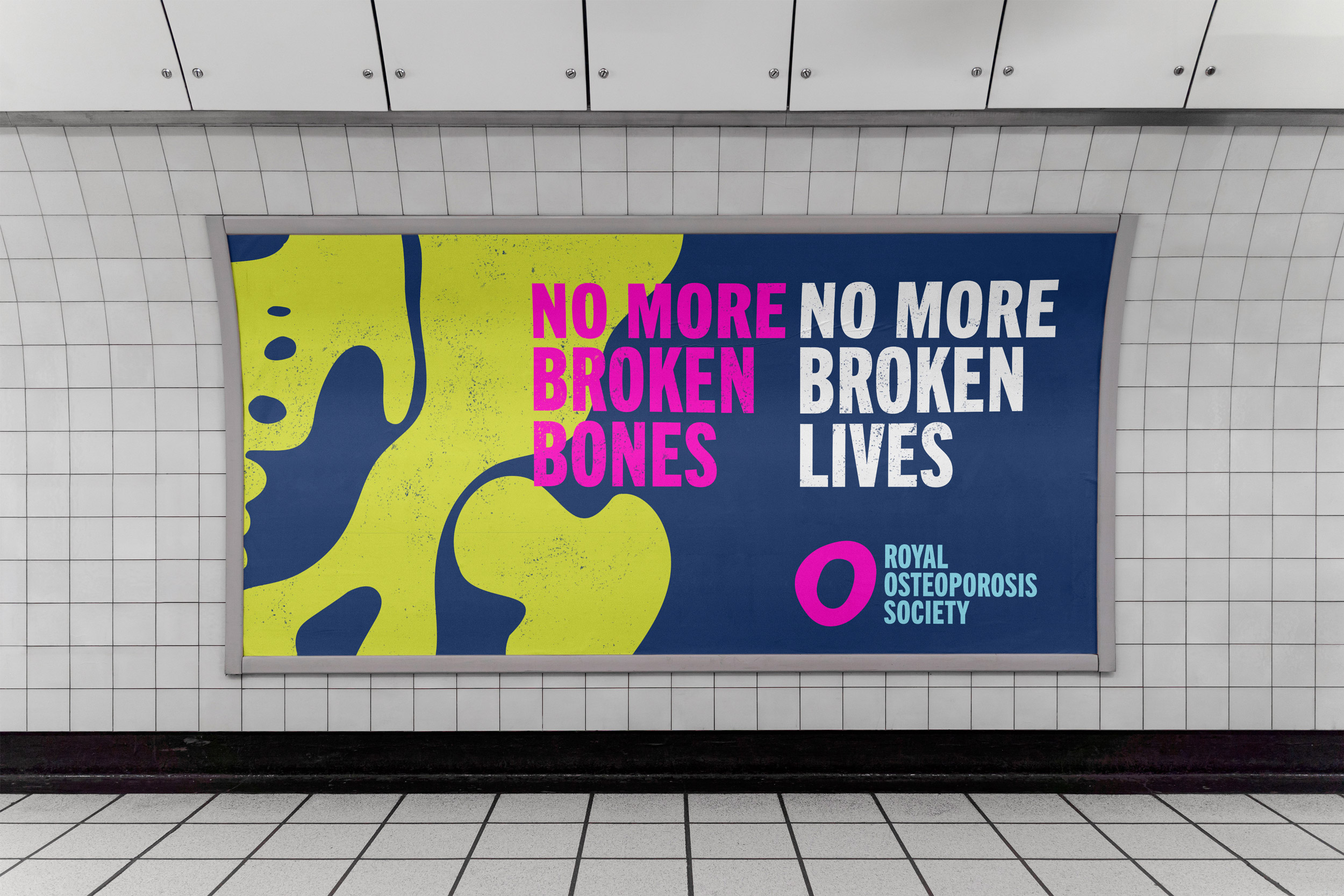
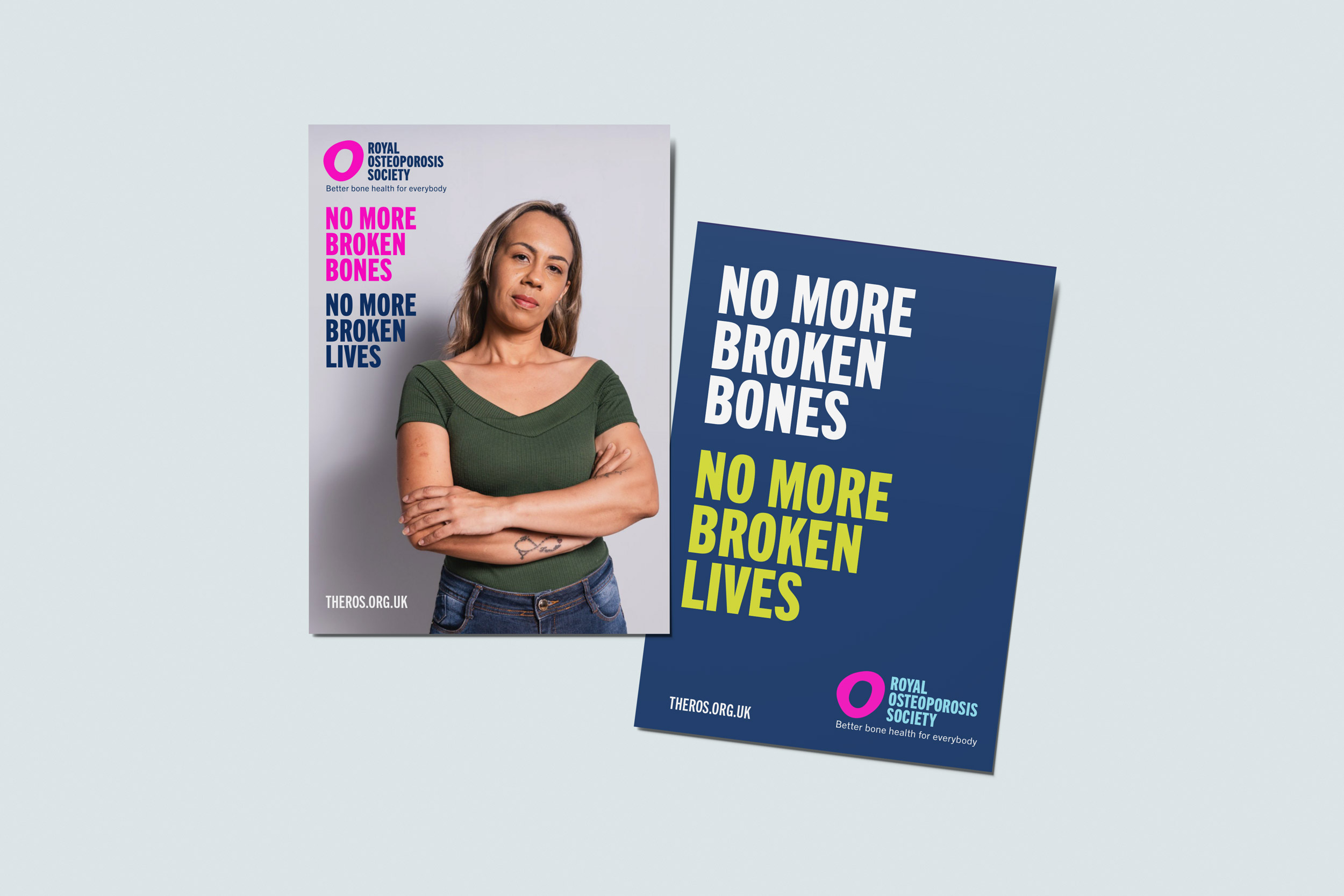
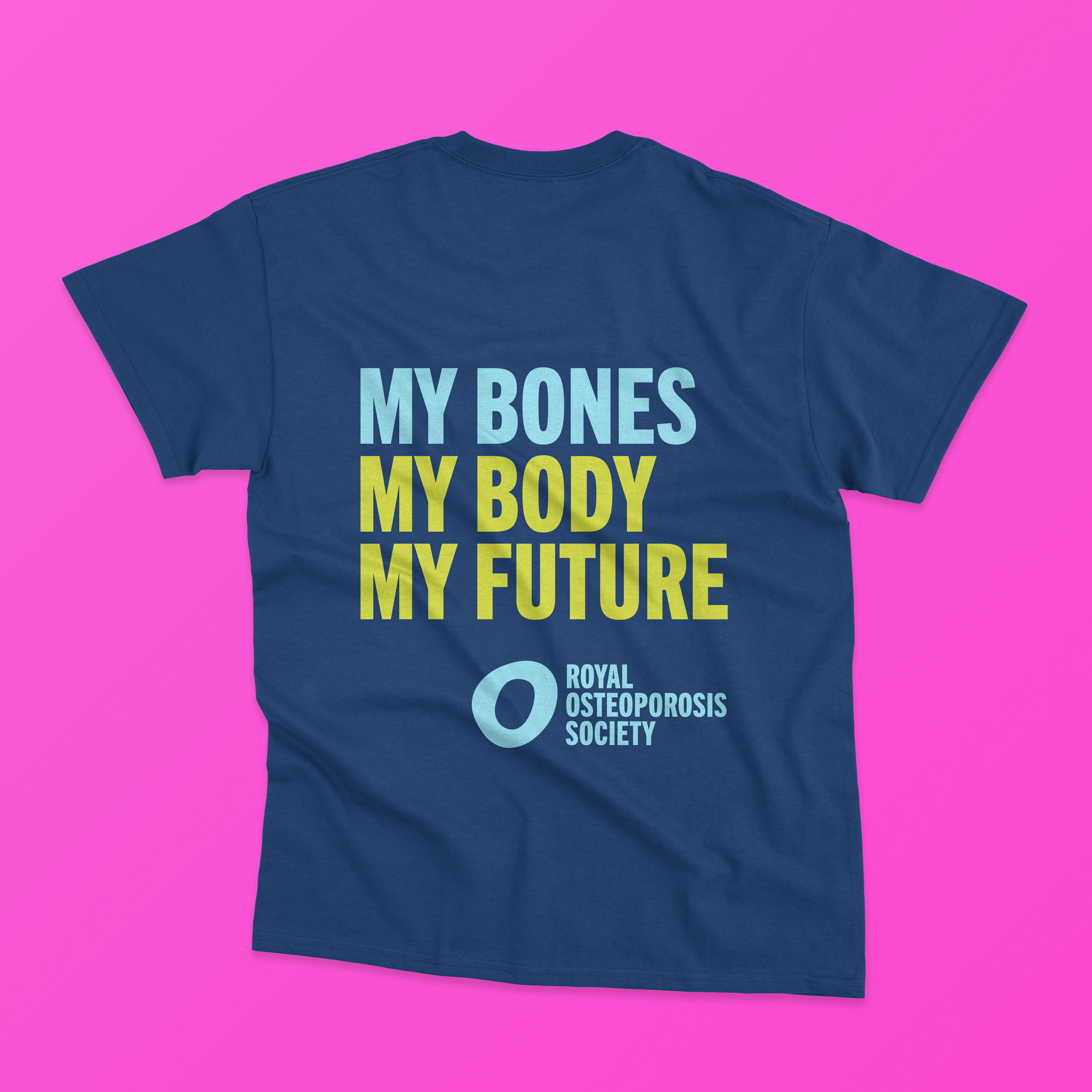
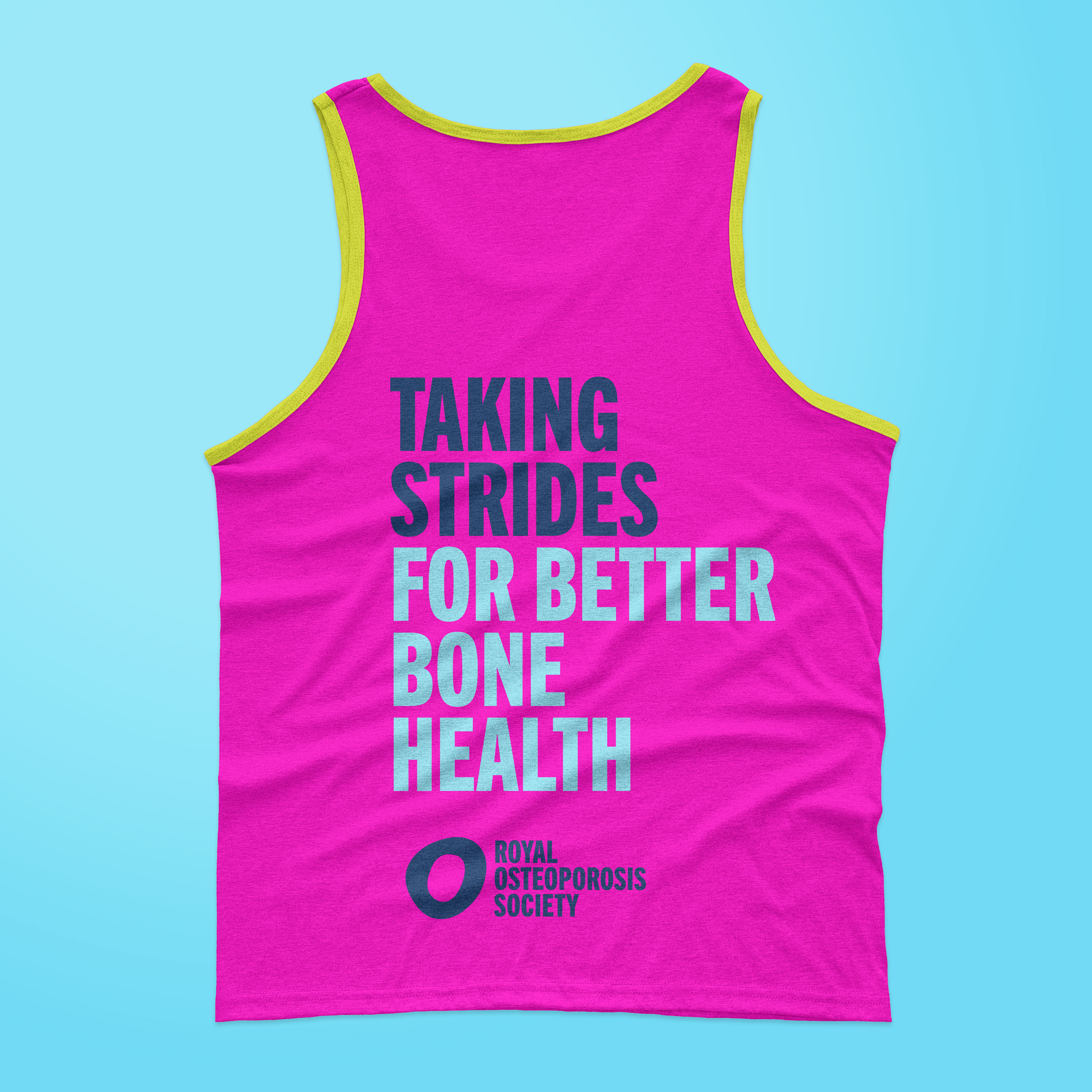
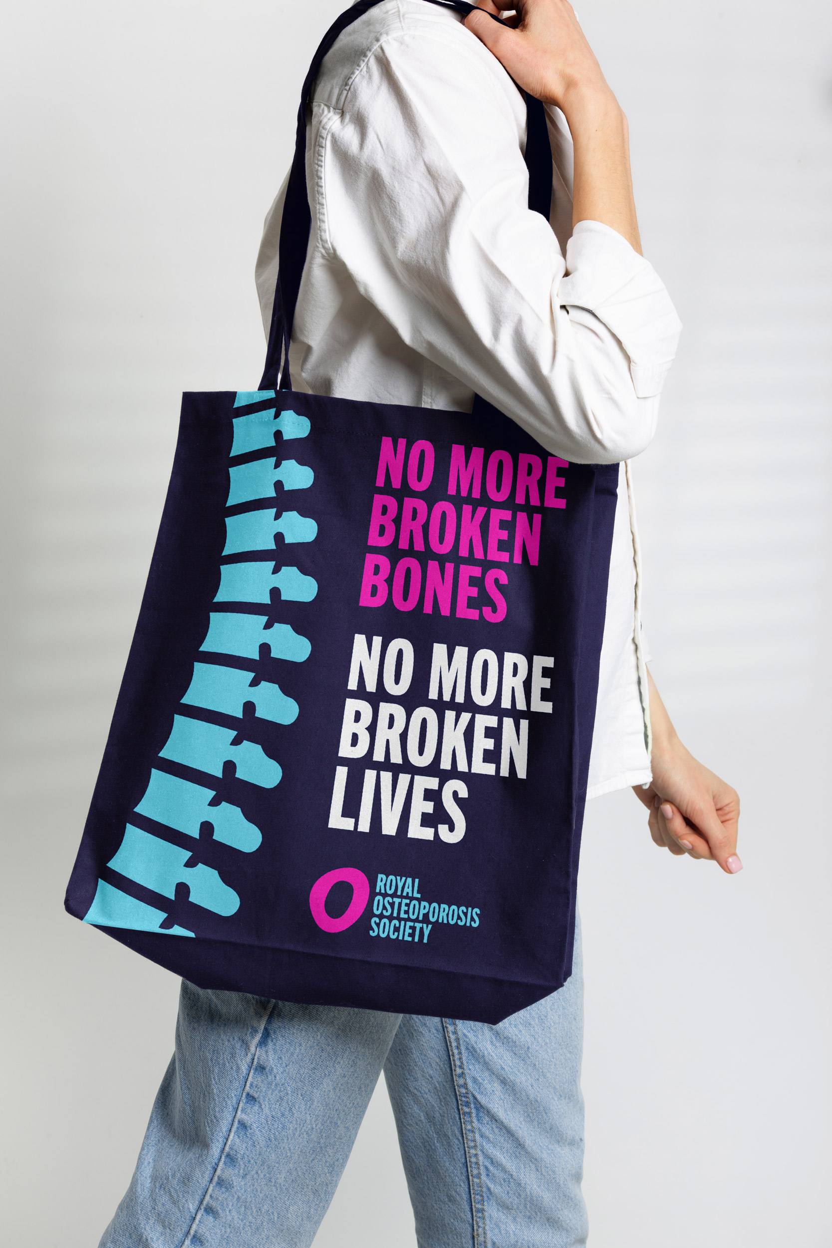
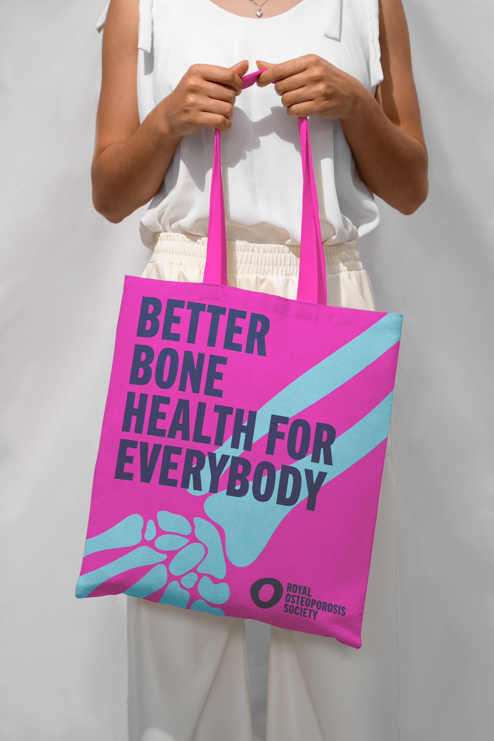
I was a lead designer on the team at Mere Mortals working on ROS rebranding. I have worked on the updated logo and visual identity that captures ROS’s values, modernises the look, yet remains recognisable, as well as the new colour palette, typography, and graphic elements that reflect a fresh, trustworthy, and professional brand.
Challenge:
Create a bold, contemporary brand identity for ROS, that will grab people’s attention, enhance awareness and relevance across a wider audience, and provide the platform to push bone health front and centre of the public agenda. This project aims to align the brand with the evolving landscape of health and wellness, particularly focusing on osteoporosis prevention and management.

If you would like to get updates on the latest projects, events and other news - subscribe here!
All works © 2011-2026 Anastasia Beltyukova (and respective clients) ● All rights reserved. ● Not to be used for AI training or any form of automated data extraction.