Rethinking Economics Rebranding
Role: Branding, Art Direction, Graphic design
Client: Rethinking Economics
Brand Strategist: Amie Brown
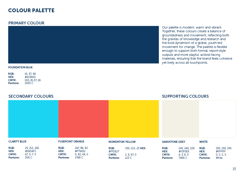
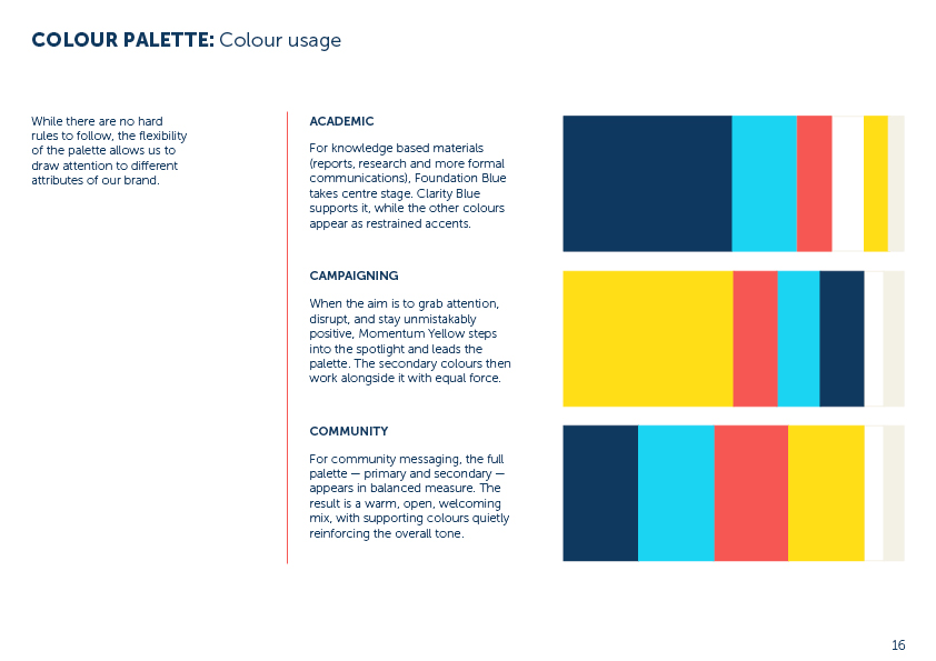
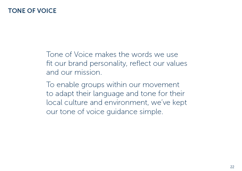
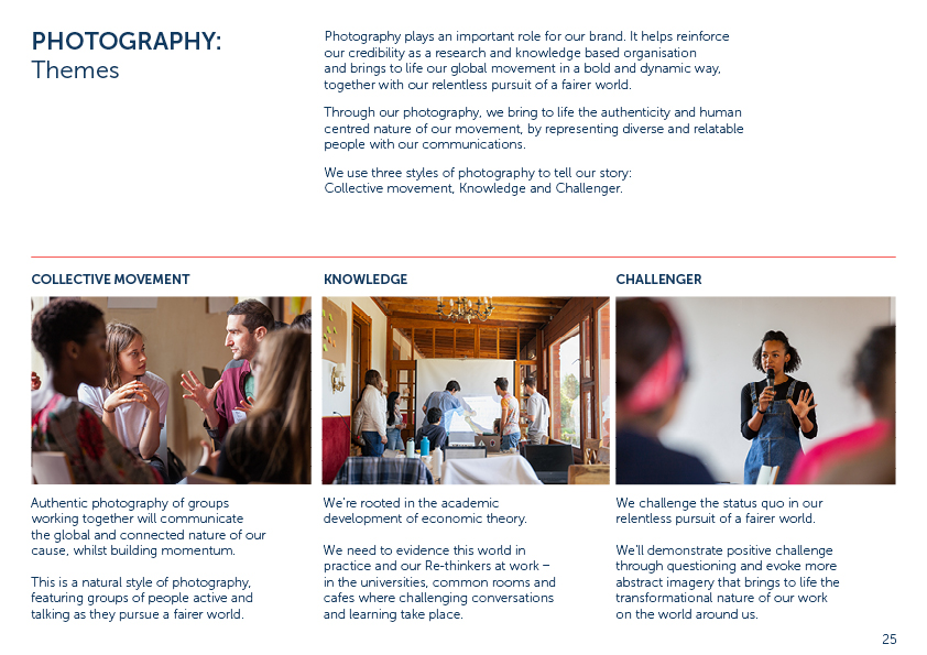
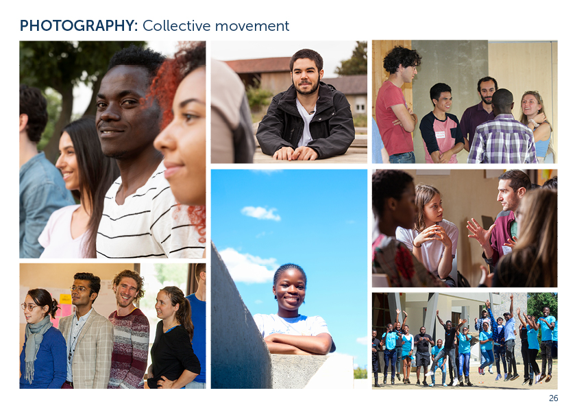
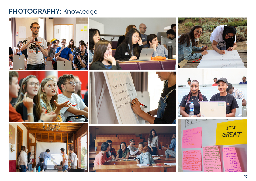
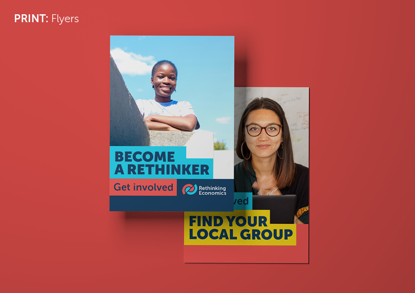
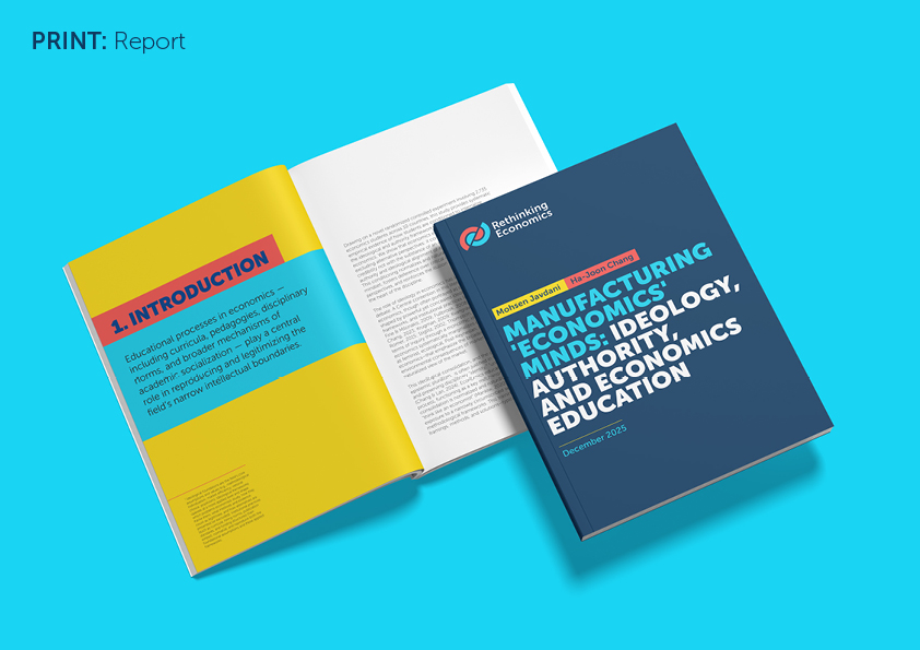
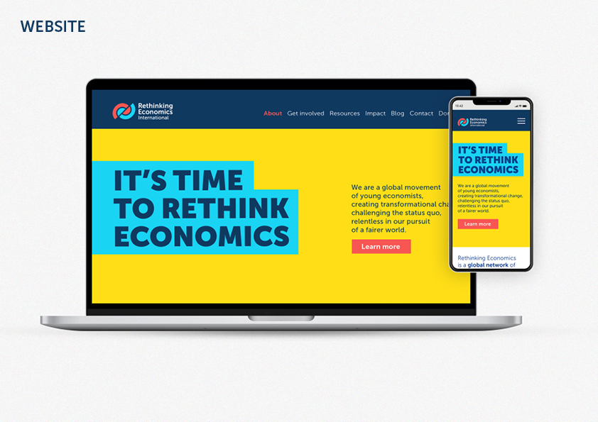
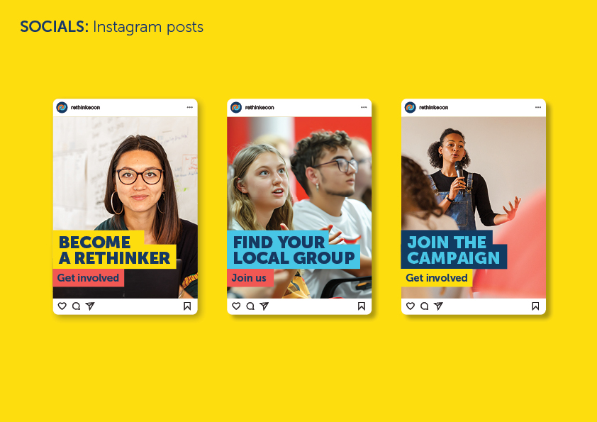
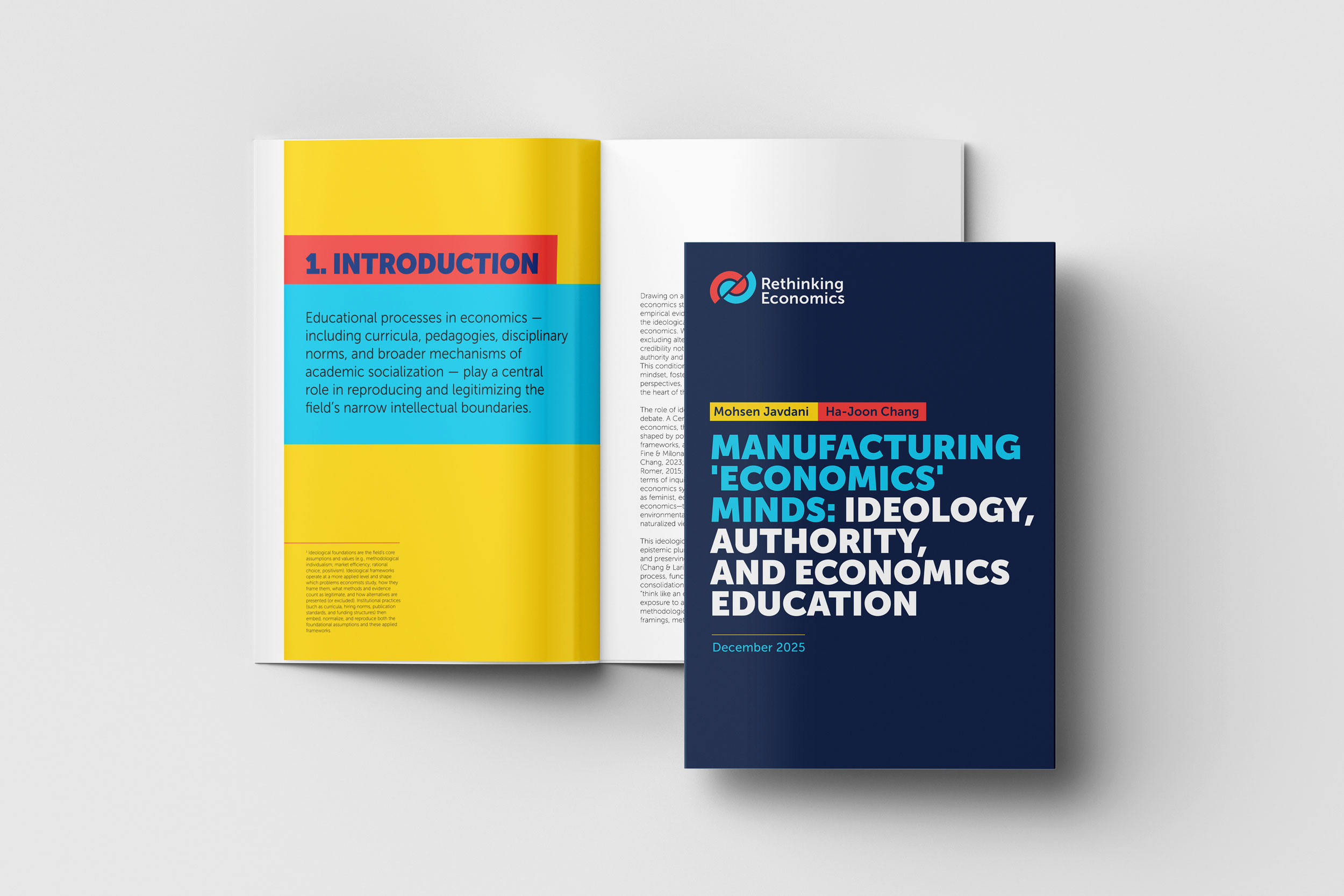
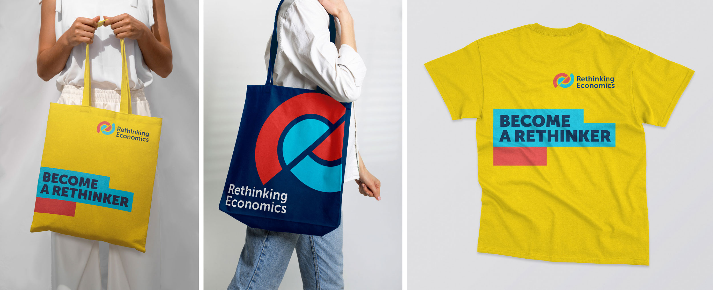
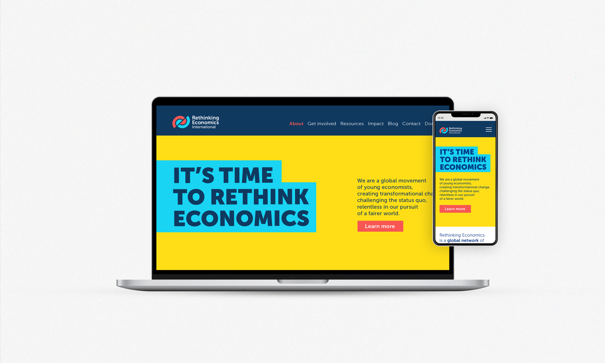
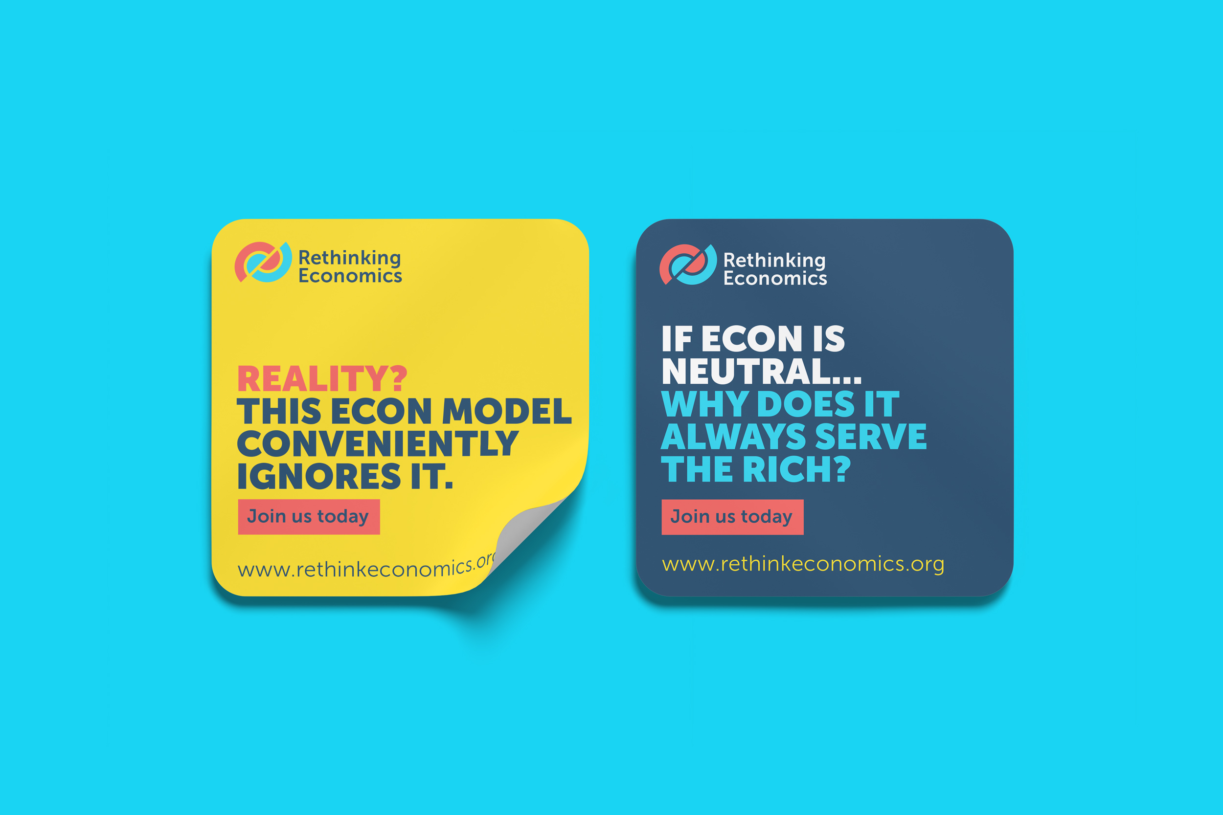
We have united with Amie Brown to work on rebranding of Rethinking Economics International. We have developed brand strategy and brand compass, redesigned the logo and refreshed the colour palette, and developed brand guidelines with recommendations on brand application, photography, typography and tone of voice.
The challenge
To develop a refreshed brand identity, that better represents Rethinking Economics, as a dynamic, transformational, youth led, movement.
Rethinking Economics is a global network of students and organisers fighting for a new way of teaching and practising economics that will truly help deal with the real-world challenges we all face today like climate collapse and inequality. An activist and campaigning movement, the organisation formed in 2012 as a network of student groups, with the primary aim of connecting people interested in real-world economic issues and calling for a more pluralist economics education. By 2014, the group had expanded to involve local groups at 65 universities across 30 countries.
The organisation is going through an exciting time of consolidation and growth; developing their website and building a membership offer that will strengthen capacity through increased funding and
active representation across student and alumni audiences.












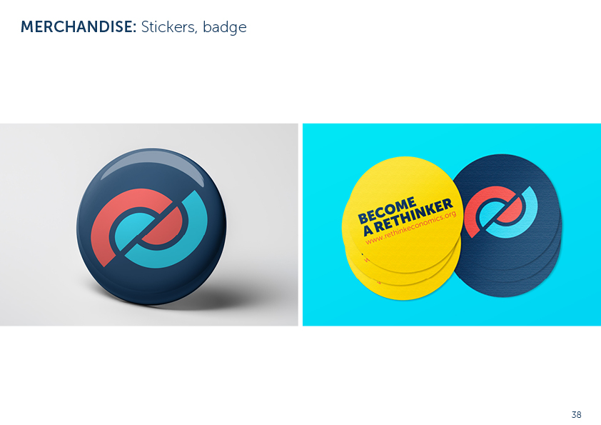
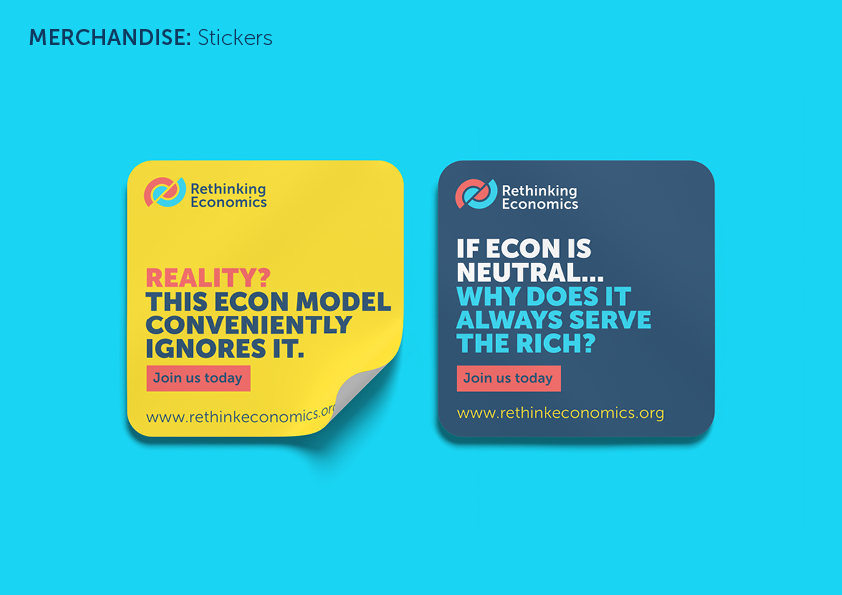

Logo
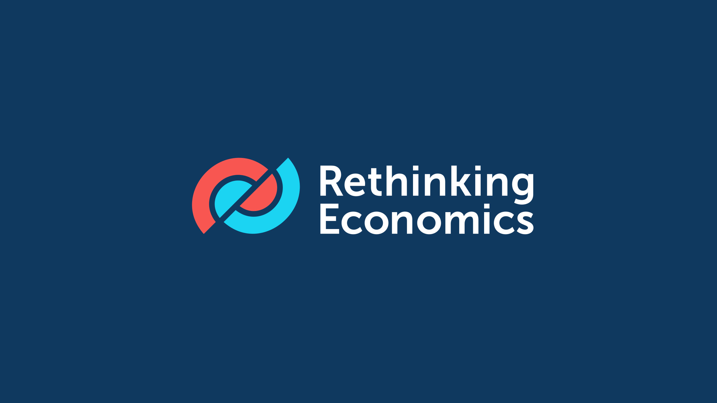
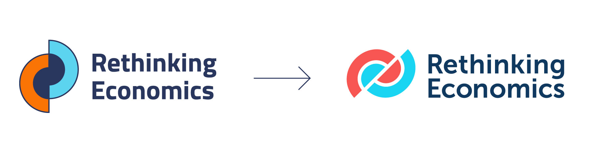
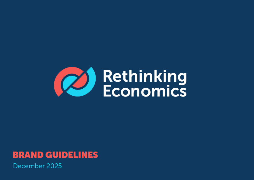
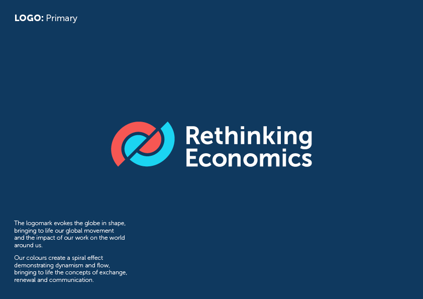
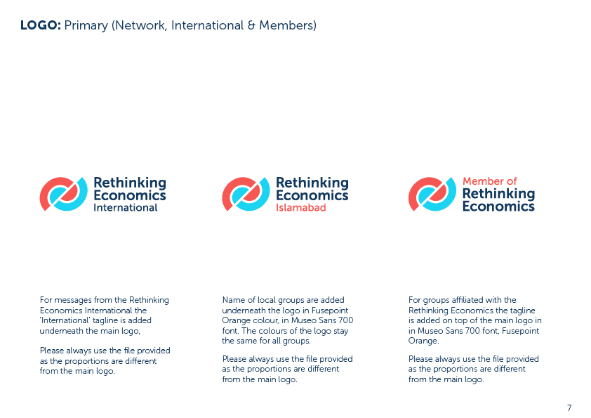
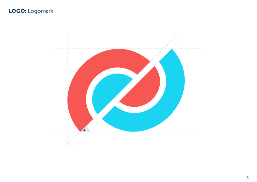
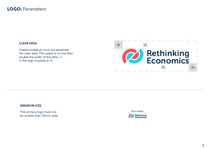
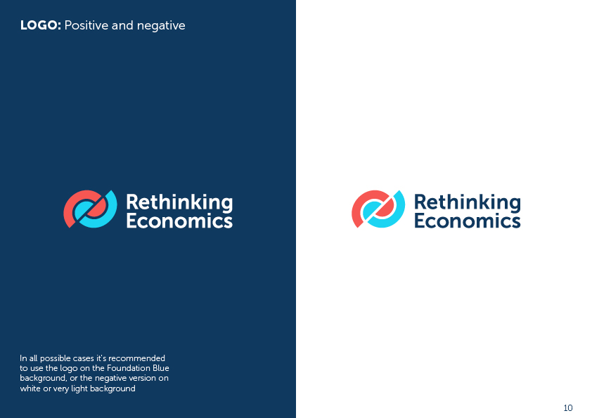
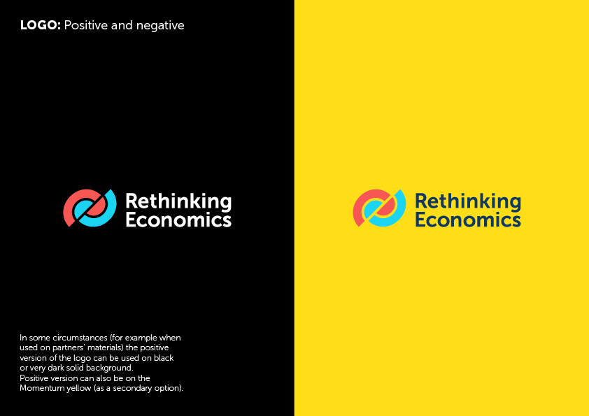
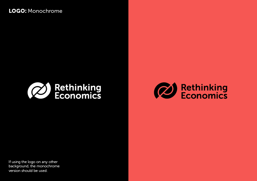
The task was to create a version that takes a step from the original logo, but still keeps the continuity by preserving the underlying structure. The tilt to 45° introduces a sense of movement and energy. The logo represents dynamic equilibrium, exchange and communication, while also hinting at the globe shape. It retains the reference to deconstruction and reconstruction.
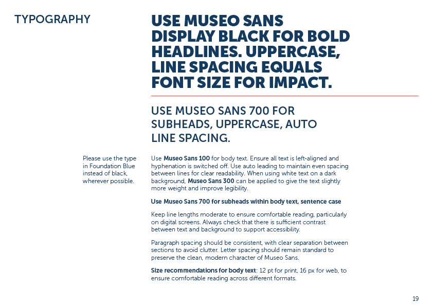
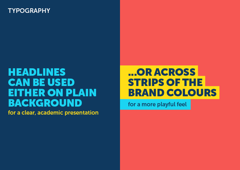
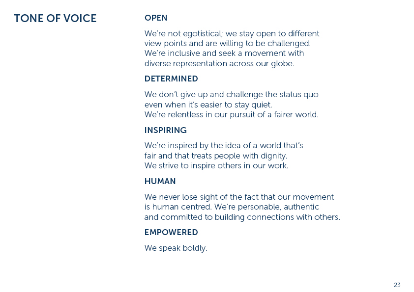
Typography has been updated to Museo Sans, a versatile sans serif with support for 24 languages, giving the brand accessibility for an international audience. Its geometric structure, softened by subtle humanist details, creates a contemporary yet approachable feel — striking the right balance between academic credibility and youthful energy. Unlike more neutral sans serifs, it carries a distinctive rhythm in its letter forms, adding personality without sacrificing clarity. Clear, legible and adaptable across digital and print, it provides a strong foundation for a brand that needs both authority and movement.



If you would like to get updates on the latest projects, events and other news - subscribe here!
All works © 2011-2026 Anastasia Beltyukova (and respective clients) ● All rights reserved. ● Not to be used for AI training or any form of automated data extraction.